How to Build a Brand Identity from Scratch: A Step-by-Step Guide for Startups
A brand identity is the system that makes a business recognisable and trusted. Here is how to build one in the right order, from positioning to guidelines, with the checks most startups skip.
To build a brand identity, work in this order: agree what the business stands for and who it serves, write a one-line positioning, set a tone of voice, design the visual system (logo, colour, typography, imagery), test it in the places customers will actually see it, then write it all down in brand guidelines. Strategy comes before design. Most identities that fail were designed first and justified later.
A brand identity is everything a customer sees and hears that tells them it is you: name, logo, colours, typefaces, imagery, tone of voice and the rules that keep them consistent. Below is the process we follow at PixelOMedia, what each step produces, how long it takes, and the mistakes founders make most often.
Brand identity, brand strategy, branding and logo: the difference
- Brand strategy is the set of decisions: who you serve, what you promise, how you differ from the alternatives and why anyone should believe you. It is a document, not a design.
- Brand identity is how those decisions are expressed: the logo, colour, type, imagery, voice and guidelines that people can see and hear.
- Branding is the ongoing work of applying that identity everywhere, consistently, so recognition builds over time.
- A logo is the single mark that signs everything. It matters, but it is one part of the identity, not the whole of it.
If a designer is asked to make a logo when the real problem is that the founders have not agreed who the brand is for, no logo will fix it. That is why brand strategy consulting often comes before identity design, not after it.
Step 1: Define the brand foundation
The foundation is four answers, written down and agreed by everyone who makes decisions in the business. Until these exist, every design choice is a matter of taste.
- Purpose: why the business exists beyond revenue, in a sentence a customer would understand.
- Audience: who you serve first. "Everyone from 18 to 45" is not an audience. "Working women in Jaipur and Delhi buying their first piece of fine jewellery" is.
- Positioning: the place you want to hold in the customer's mind compared with what they would otherwise choose, including doing nothing.
- Proof: the reasons to believe you, such as heritage, a process, a material or a founder's expertise.
To get there, talk to real customers before you talk to designers. Ask why they chose you, what nearly stopped them and what they compared you with. Then put your competitors' websites side by side and list the words they all use. Nobody will remember you for saying those words too.
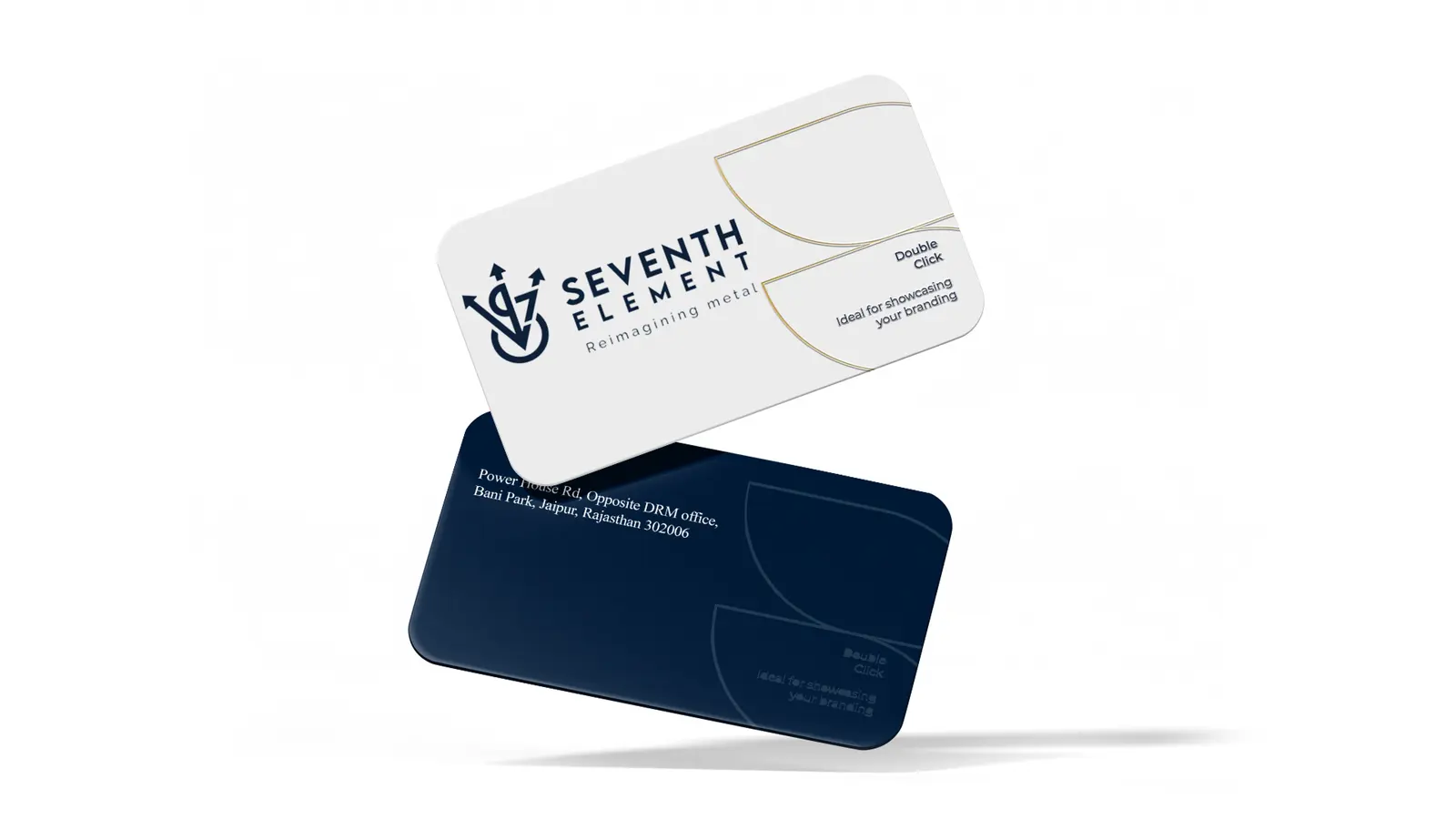
Proof is where a brand gets its texture. Seventh Element, a metalware and décor brand founded in 2018, rests on its founder Vijai Pal Singh's four decades of metal craftsmanship and takes its name from the seven metals of ancient alchemy. A story that specific gives an identity something real to draw on, instead of the same "premium quality" language every competitor uses.
Step 2: Set the tone of voice
Tone of voice is how the brand sounds in every sentence, from the homepage headline to a WhatsApp reply. Set it before the visual design, because the way a brand speaks shapes the way it should look.
Choose three or four voice traits and give each one a "this, not that" line: warm, not chatty; confident, not boastful; plain, not technical. Then write sample lines for real situations: the Instagram bio, an apology for a delay, a reply to a customer who says you are too expensive. Your team will copy the examples, not the adjectives.
Indian brands have one extra decision to make early: language. Will you write in English only, in Hindi and English, or in a regional language for some markets? Will social media be in Hinglish while the website stays formal? These are identity decisions, and they reach into typography, because a typeface that supports Devanagari or another script has to be chosen at the start, not bolted on later.
Voice is often where a heritage business modernises first. Kaleen India's rug brand has over 60 years in textiles, a Jaipur headquarters and production units in Mirzapur and Panipat, and came to us wanting to feel more modern and stand apart from other rug makers. Tone of voice was part of that work, and what the client singled out afterwards was how the brand now articulates its focus on sustainability and craftsmanship.
Step 3: Design the visual identity system
The visual identity is the logo plus everything around it: colour, typography, imagery and graphic elements. Design it as a system that works across a phone screen, a shop sign and a printed box, not as a logo with extras added later.
- Logo suite: a primary logo, a horizontal or stacked version, a symbol or monogram for small spaces, and single-colour versions for stamps, embossing and embroidery.
- Colour palette: one or two primary colours, a few secondary colours and neutrals, each given in HEX and RGB for screens, CMYK for print, and a Pantone reference where colour accuracy matters, such as packaging and signage.
- Typography: a heading typeface and a body typeface, with licences checked for web, print and app use, and a matching Devanagari or regional face if you publish in those scripts.
- Imagery: a direction for photography and illustration, and what never to use.
- Graphic elements: a pattern, shape or layout device that makes your material recognisable even with the logo covered.
Ask to see more than one direction. We present multiple creative directions, each built on an insight from the foundation work, so founders choose between ideas rather than between colours, then refine one in structured feedback rounds.
Check colour contrast while you choose the palette, not after the website is built. The web accessibility standard, WCAG 2.2, asks for a contrast ratio of at least 4.5:1 for normal text and 3:1 for large text at its AA level. A soft, pale palette that fails those numbers will cause problems on every screen the brand appears on.
Step 4: Test it where customers will meet it
Before you sign off, put the identity into the real places it has to work. Plenty of identities look perfect on a slide and fall apart in a crowded feed.
- Instagram and WhatsApp profile pictures, which are cropped to a circle and shown very small.
- The browser tab icon, at 16 to 32 pixels.
- Your Google Business Profile, marketplace listings and app icon, placed next to your competitors'.
- The first screen of your website on a mid-range phone, outdoors in daylight.
- Print: visiting cards, packaging, shop signage, and single-colour uses such as a rubber stamp or an embroidered uniform.
- The legal check: search your name and logo against existing marks in your classes on the Trade Marks Registry public search (opens in a new tab) before you print anything, and take professional advice before you file.
When it passes, launch it everywhere together. A customer who has never heard of you will notice when your Instagram, website and packaging look like three different companies, and that doubt costs you the sale.
Step 5: Write the brand guidelines
Brand guidelines are the rulebook that keeps the identity consistent once people other than the designer start using it. Without them, every new hire, freelancer and printer makes their own choices.
- Logo use: versions, clear space, minimum sizes and the things never to do, shown as examples.
- Colour codes in every format, with which colours lead and which support.
- Type hierarchy for headings, body text and captions, on screen and in print.
- Photography and illustration direction, with approved and rejected examples.
- Tone of voice: the traits, the "this, not that" lines and sample copy.
- Ready templates for social posts, presentations, email signatures and stationery.
- One organised folder of master files, and a named person who approves anything new.
Keep them short enough that your social media manager and your printer will actually open them. A practical document that gets used beats a thick book that sits in a drive.
How long it takes and what it costs
Working with a studio, expect two to three weeks for a logo project and four to six weeks for a complete identity with positioning, voice and guidelines. A full rebrand of an established business typically takes eight to twelve weeks, because there is more to keep, more people to agree and more material to replace.
We quote brand identity design to each brief after a free discovery call, because what moves the price is scope: how much research is needed, how many sub-brands or product lines there are, packaging ranges, and how many launch assets you need on day one. If you are comparing studios, our guide on how to choose a branding agency lists the questions to ask before you sign.
Mistakes to avoid
- Starting with the logo. Design without strategy produces a mark the founders like and customers do not remember.
- Copying the category leader. If your colours and type look like the biggest name in your market, you are advertising for them.
- Designing for the founders' taste instead of the audience's.
- Too many colours and typefaces. A tight palette is easier to recognise and to use.
- Skipping the trademark search and having to rename after launch.
- Treating launch as the finish line, with no guidelines or templates, so the brand fragments within a year.
We look at the wider pattern behind these in why startups fail at branding. The short version: a brand identity is not a set of files. It is a set of decisions, made visible and kept consistent.
Questions people ask
Can I build a brand identity myself?
You should do the foundation yourself, because nobody knows the business better. The visual system is where a professional designer earns their fee, since it has to work across screens, print and packaging for years.
How long does it take to build a brand identity?
With a studio, a logo takes two to three weeks and a complete identity four to six weeks. A full rebrand of an established business usually takes eight to twelve weeks.
When should a business rebrand instead of refreshing?
Refresh when customers recognise and like the brand but it looks dated. Rebrand when the business has outgrown it: a new audience, new product lines the old identity cannot hold, or a reputation you need to move away from. A good rebrand keeps what customers already recognise and rebuilds the rest.
Filed under Guides. Written by the strategists at PixelOMedia, Jaipur.
Brand identity design from our Jaipur studio: logos, identity systems, guidelines and decks people remember and trust.