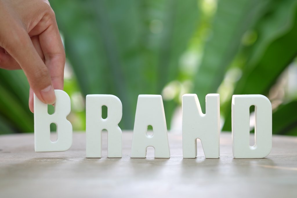
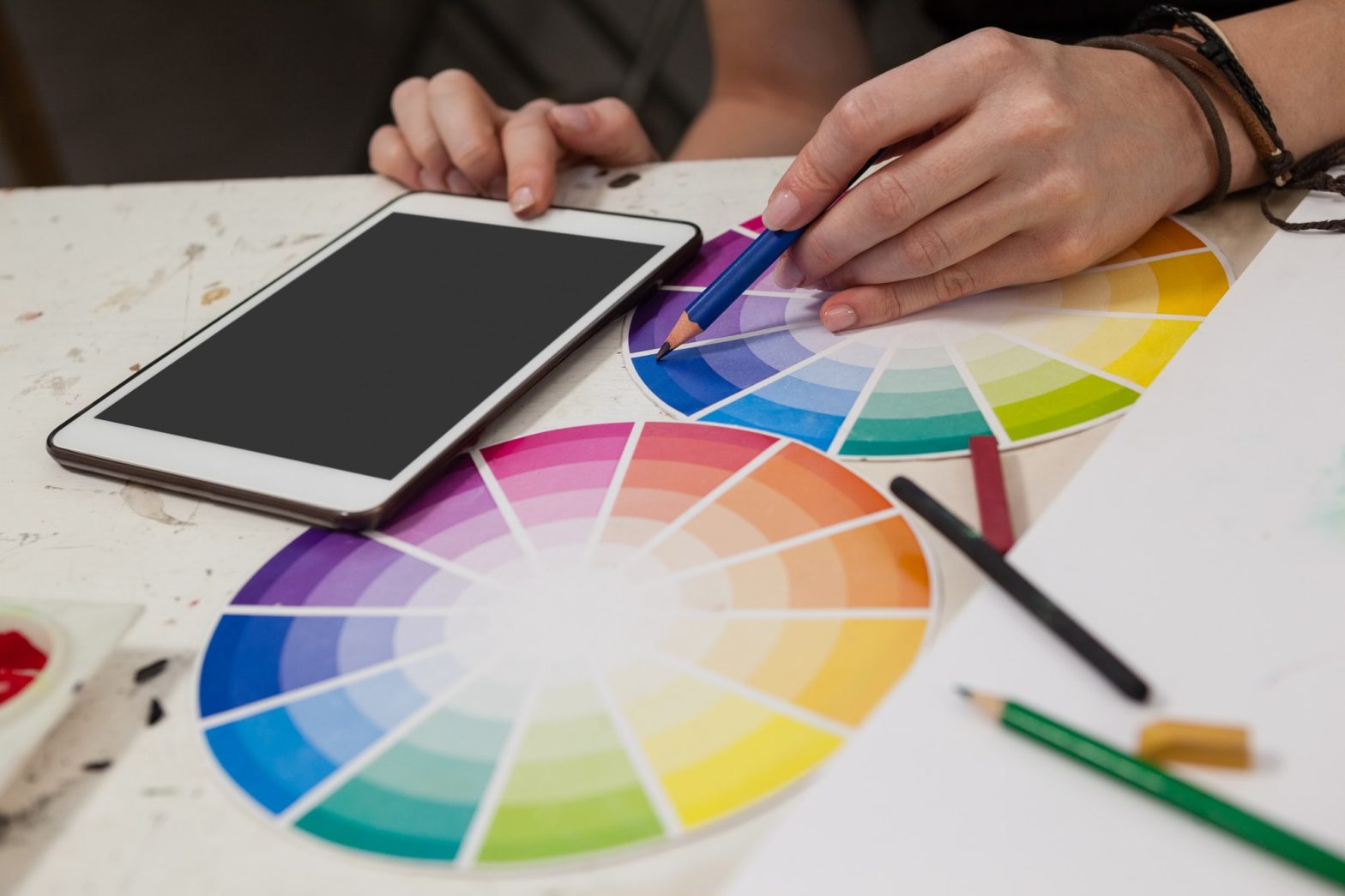
In the ever-evolving world of branding, the logo stands as the silent ambassador of a company. It is the first visual representation that connects with a potential customer, communicates brand values, and anchors all marketing efforts. At PixelOMedia, we understand that crafting a logo isn’t merely a creative endeavor it’s a powerful blend of artistry and science. A great logo does more than look good; it tells a story, builds trust, and sparks recognition. In this blog, we take you behind the scenes of logo design to explore the dual forces that shape it—the human imagination (art) and the strategic structure (science). What Is a Logo? Let’s begin with a fundamental question: What is a logo? A logo is not just a symbol, a name or a fancy graphic – it is the face of your brand. It’s the mark that appears on your website, product, packaging, social media, and every customer touchpoint. More than its visual appearance, a logo serves as: A memory trigger for your audience A representation of your brand’s mission and values A trust signal that shows you’re professional and established From tech startups to legacy fashion houses, every successful brand has one thing in common an iconic logo that resonates. The Role of Logos in Brand Identity A strong brand is cohesive, consistent, and clear. The logo is at the heart of this cohesion. It sets the tone for all other visual elements like color palettes, typography, photography style, and layout structure. At PixelOMedia, our logo design process doesn’t just focus on the symbol it forms the foundation of a complete brand system. Because when your logo aligns perfectly with your brand identity, it empowers all your marketing initiatives from digital ads to business cards. Think of your logo as: 🧭 The compass: guiding your visual decisions 🧩 The piece: that brings all brand assets together 🎯 The target: hitting the emotional and cognitive sweet spot of your audience The Art of Logo Design: Intuition, Emotion & Expression The art side of logo design taps into human emotion, culture, symbolism, and beauty. It’s about visually expressing what words alone cannot. At PixelOMedia, we believe that every brand has a soul—and a great logo captures that soul with visual clarity. It should feel effortless, yet meaningful; simple, yet memorable. Here are the artistic pillars of logo creation: 1. Visual Storytelling Your logo should tell a story—of your origin, your values, your ambition. Whether through abstract symbols or stylized typography, a good logo invites people into your brand narrative. Example: The arrow hidden in the FedEx logo suggests precision and speed. It’s subtle, yet powerful. 2. Emotional Resonance Humans respond to visuals emotionally. Colors, curves, sharp edges, and whitespace all contribute to how a logo feels. That feeling can be calm, exciting, luxurious, grounded, bold, or warm. Example: The rounded font and playful palette of Google evoke friendliness and accessibility. 3. Aesthetic Balance Symmetry, proportion, contrast, alignment—these design principles are key to visual appeal. While this veers into science, it’s also artistic because beauty is intuitive. A logo must “feel right” at first glance. 4. Memorability & Originality Great logos are instantly recognizable. Think Apple’s bitten apple or Nike’s swoosh. Their power lies in being different, yet deceptively simple. At PixelOMedia, we chase that delicate balance. 5. Cultural Sensitivity Design exists within a context. A symbol that works in one culture may offend in another. We consider your audience’s geography, beliefs, and behavior patterns during the design phase. The Science of Logo Design: Research, Psychology & Strategy While the art grabs attention, it’s the science that ensures your logo serves a long-term strategic purpose. Logo design is rooted in psychology, semiotics, usability, and scalability. At PixelOMedia, we use a structured approach based on market insights, human behavior, and brand positioning. Let’s dive into the scientific underpinnings of logo design. 1. Color Psychology Colors aren’t just decorative—they evoke emotions and influence perception. This makes color choice a critical strategic decision in logo design. 🔴 Red: energy, excitement, urgency (e.g., Coca-Cola) 🔵 Blue: trust, calm, professionalism (e.g., IBM, Facebook) 🟢 Green: growth, eco-consciousness, stability (e.g., Whole Foods) 🟡 Yellow: optimism, cheerfulness, clarity (e.g., McDonald’s) ⚫ Black/Grey: sophistication, authority, timelessness (e.g., Chanel) The science lies in choosing colors that align with your brand values, target audience, and industry standards, while still standing out. 2. Typography Psychology Fonts are visual voices. Serif fonts feel traditional, while sans-serifs are modern and clean. Script fonts express elegance, while bold fonts convey strength. Font choice affects: Perceived tone (casual vs. formal) Readability across platforms Brand personality projection A playful DTC brand may opt for rounded sans-serif fonts, while a law firm needs a sharper, more structured typeface. 3. Shape & Form Semiotics Shapes have meaning. Circles symbolize unity and harmony. Squares imply stability. Triangles represent innovation or movement. Organic shapes feel approachable. Geometric shapes convey precision. We strategically use shapes to encode brand perception. 4. Simplicity for Scalability Your logo must perform across sizes—from a favicon to a billboard. Simplicity ensures it remains recognizable, even in limited spaces or when printed in black and white. We test logos in multiple formats to ensure: Scalability Legibility Versatility 5. Competitive Landscape Analysis Your logo must differentiate. We conduct deep industry research to identify visual tropes and clichés in your sector- then position your brand with a fresh, unique identity. 6. Target Audience Alignment Every design choice—from colors to shapes—is guided by your audience’s preferences, behaviors, and needs. A logo that connects with Gen Z won’t be the same as one that appeals to enterprise decision-makers. Our Proven Logo Design Process at PixelOMedia We don’t believe in one-size-fits-all solutions. Our process is deeply collaborative, human-centric, and driven by your brand’s unique DNA. Here’s how we build logos that stand the test of time: Step 1: Discovery & Brand Audit We begin by understanding your: Mission, vision, values Audience personas Competitive positioning Business goals- This phase is about listening deeply and asking the right questions.… Continue reading The Art & Science of Logo Design: Where Creativity Meets Purpose