The festival of colors, Holi, is here and I just have one question for you-Can you imagine a world without colors? How dull and boring, right? Well, the same goes with branding. The colors you choose for your brand not only makes it interesting and aesthetically pleasing but also sets the mood and tone of your brand. One of the most important aspects of establishing brand identity is having the right color palette which helps in expressing what your brand stands for. Let’s take a deeper dive into the world of colors and find out why the right colors are so important to establish and polish your brand identity.
Bringing Consistency-
Having an inconsistent brand identity is like watching a badly edited movie. You can piece together the scenes and try to make sense of what happened, but it would be next to impossible for you to decipher the concluding message that the film wants to give out. Having a set colour palette will add consistency to your brand and your social media will look more cohesive and put together. With a fixed colour scheme your target audience will be able to figure out the mood and personality of your brand which will help them to connect with it in the best way possible.
Adding the Recall Value-
Apart from adding consistency, a fixed colour scheme will add to the recall value of your brand. When you see a new app or product in your vicinity, one of the first things you notice is the colours that define the brand. Colours actually have a higher recall value than a name and are remembered more easily because of their visual characteristic.
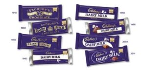
MAKING IT DISTINCTIVE-
It is obvious that a set scheme and palette of colours will help in making your brand distinguishable. The colours ascribed to your brand will make it stand out from your competitors. For example, the world-renowned confectionery brand Cadbury has been using the same purple colour for their packaging since time immemorial. This congruency in the usage of colour makes it stand out and we’re able to distinguish it from its other competitor brands.
SERVING YOUR PURPOSE-
The colours you choose should address the purpose of your brand subliminally. For Example, McDonald’s’ famous yellow arches over the vibrant red induce the feeling of hunger among the consumers which is exactly what the company wants-hungry people that want to have appetizing and easily accessible food. This step can be a hit or miss depending on how deep your understanding of colour psychology runs. The main aim here is to go with colours that will serve some purpose be it setting the tone or giving an accurate message about your brand rather than just going randomly with any colour that you like to see.
SETTING THE TONE-
When you choose colours to establish your brand’s identity make sure that they describe exactly what you want to convey to your target audience. The choice of colours is going to determine how the consumers are going to perceive your brand. The tone you set with the help of colours will help the consumers to perceive the mood and tone of your brand. The young and fun brands use more vibrant colours, and the earnest brands use more muted or darker shades for their branding.
Colours are an integral part of each and every element of our lives. Colours are all around us in abundance, we just need to make sure we are utilising them correctly keeping the rules, theories, and principles of colours in mind. For branding, how we play with colours, tints and shades is very important for several reasons but often the abundance of choice when it comes to colours can be overwhelming. If you’re stuck in such a situation where you can’t really figure out how to execute your branding ideas into profitable actions, We are here for you. Check out our website https://pixelomedia.com/ for more information. Let’s be #pomified